

Enhance Your Power BI Dashboard Visual with Condition-Based Formatting
Learn the basics of Power BI and how to create your first dashboard.
Feb 5, 2026
 5 min read
Explore the most effective KPI visualization techniques including KPI cards, line charts, bar charts, heat maps, real-time dashboards, and interactive business intelligence reporting.
55 min read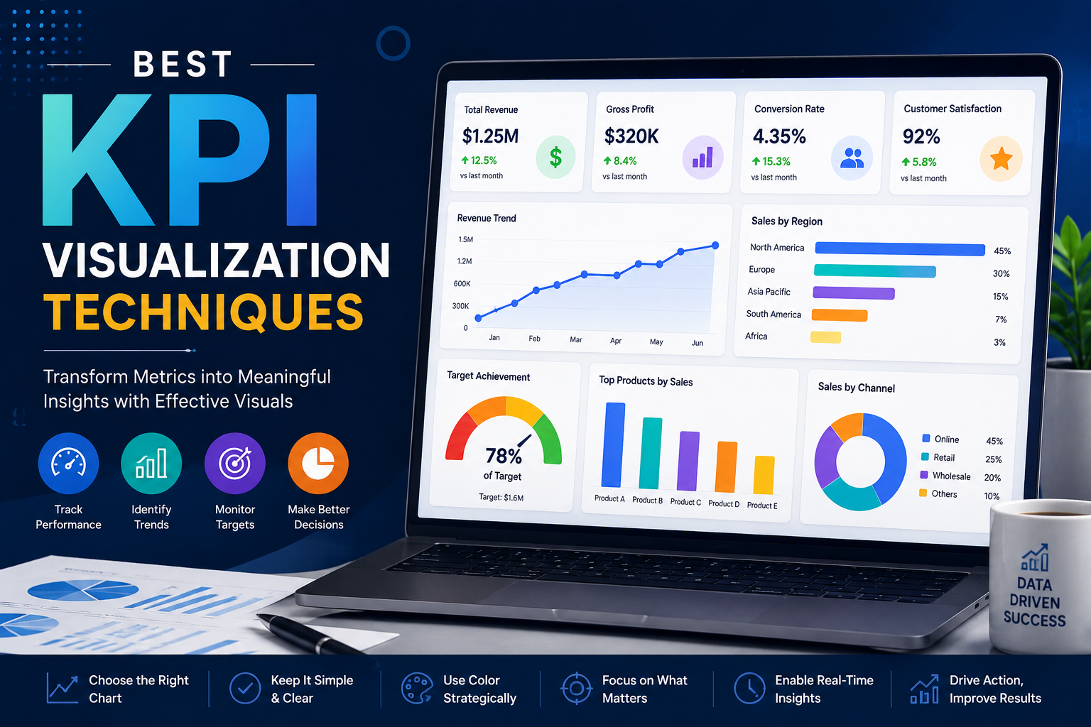
50 articles found
Learn the basics of Power BI and how to create your first dashboard.
5 min read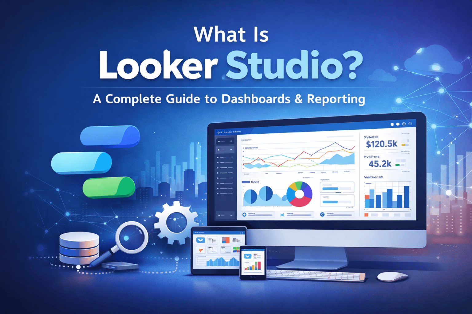
Learn what Looker Studio is, how it works, and how businesses use it to build interactive dashboards...

Learn how secure Looker Studio is for business data. Explore security features, risks, best practice...

Learn what data visualizations are and discover their three most important goals: communication, dis...
5 min read
Unlock deeper insights with interactive data visualization powered by Power BI. Explore how dynamic ...
5 min read