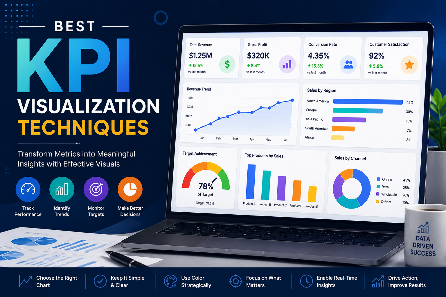
Best KPI Visualization Techniques
Explore the most effective KPI visualization techniques including KPI cards, line charts, bar charts...
May 25, 2026
Explore the most effective KPI visualization techniques including KPI cards, line charts, bar charts, heat maps, real-time dashboards, and interactive business intelligence reporting.
12 articles found
Explore the most effective KPI visualization techniques including KPI cards, line charts, bar charts...
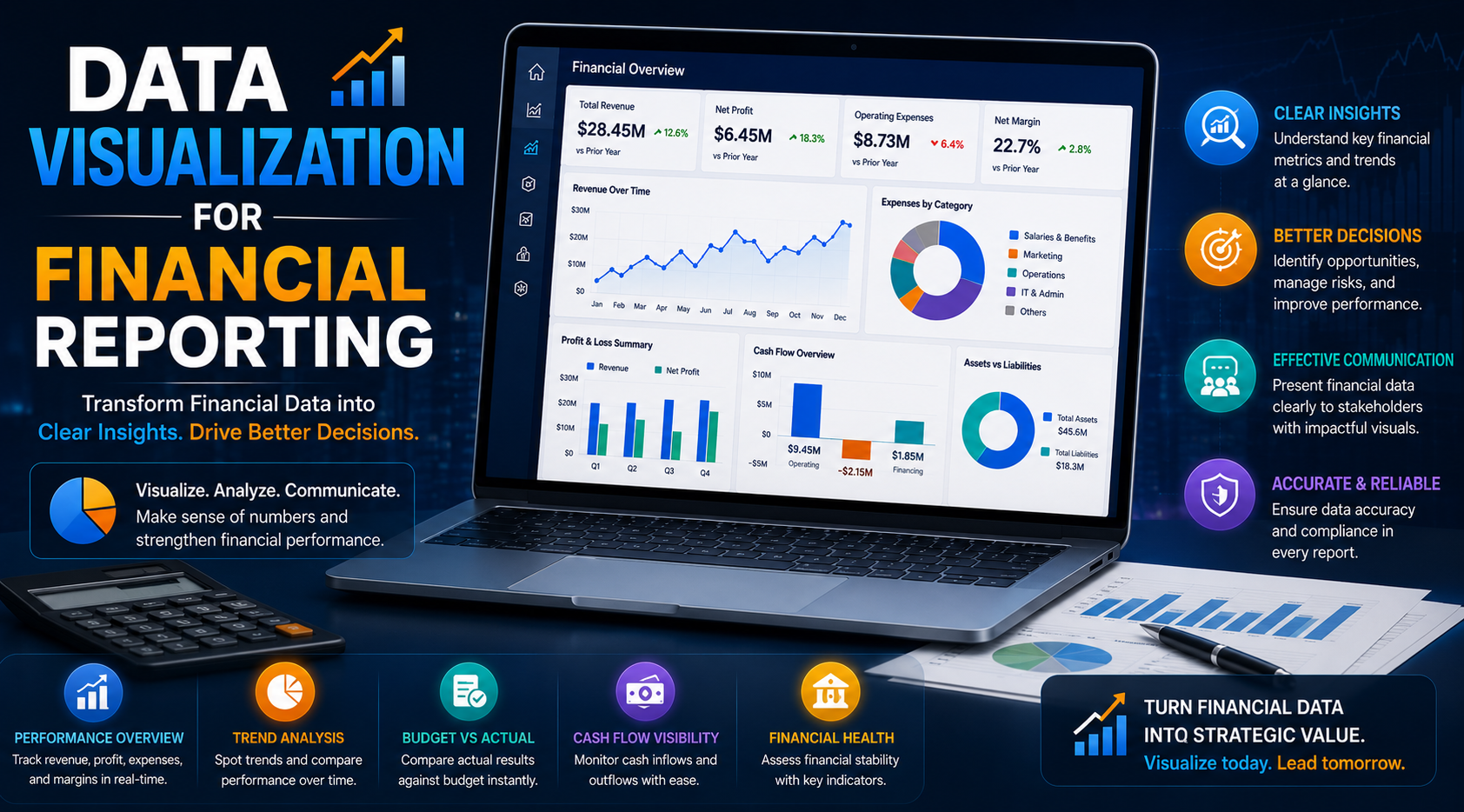
Learn how data visualization improves financial reporting through KPI dashboards, executive reportin...

Learn how secure Looker Studio is for business data. Explore security features, risks, best practice...

Learn how data visualization helps businesses improve decision-making, performance, and competitive ...

Explore interactive data visualization in Power BI. Learn how to build dynamic dashboards, improve u...
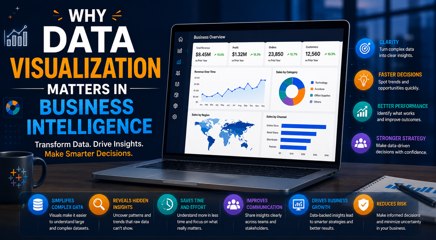
Learn why data visualization is critical for business intelligence, KPI reporting, real-time analyti...
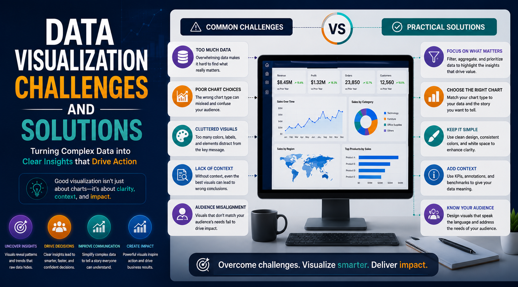
Explore major data visualization challenges and practical solutions for dashboard optimization, anal...

Unlock deeper insights with interactive data visualization powered by Power BI. Explore how dynamic ...
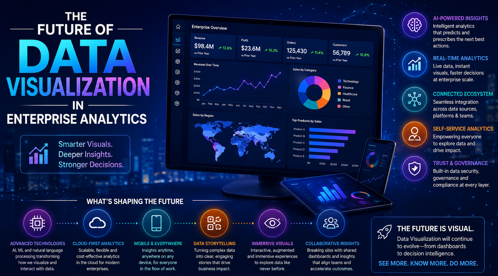
Explore the future of enterprise data visualization, including AI-powered analytics, real-time dashb...
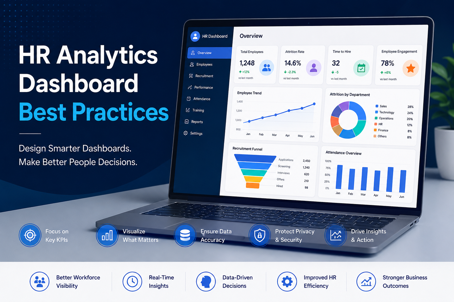
Explore best practices for HR analytics dashboards including workforce KPIs, employee engagement tra...
Explore how data visualization is transforming intelligent business strategies through real-time ana...

Learn what data visualizations are and discover their three most important goals: communication, dis...