Key Performance Indicators (KPIs) are essential for measuring business performance, tracking operational efficiency, and supporting strategic decision-making. Organizations across industries rely on KPIs to monitor growth, identify risks, and evaluate business success.
However, simply collecting KPI data is not enough. Businesses must present KPI information in a way that is clear, actionable, visually engaging, and easy to interpret.
This is where KPI visualization becomes critical. Effective KPI visualization transforms raw business metrics into interactive dashboards and meaningful visual insights that help organizations make faster and more informed decisions.
Modern enterprises use KPI dashboards to monitor:
- Sales performance and channel conversion rates
- Financial health, profitability, and cost margins
- Marketing campaigns and ad spend efficiencies
- Workforce productivity and employee performance
- Operational efficiency, supply chains, and logistics
- Customer engagement and retention trends
- High-level executive performance metrics
At KnexBI, organizations increasingly implement KPI reporting systems using platforms such as Microsoft Power BI, Tableau, and Looker Studio to improve business intelligence and enterprise reporting.
In this article, we’ll explore the best KPI visualization techniques, common dashboard mistakes, visualization best practices, and how organizations can improve business reporting through effective data visualization strategies.
Why KPI Visualization Matters
Businesses generate enormous amounts of operational data every day. Without visualization, KPIs often remain trapped inside dense spreadsheets, raw databases, static documents, and disconnected legacy systems.
This data silo makes it highly difficult for decision-makers to quickly identify hidden trends, performance issues, operational bottlenecks, and emerging business opportunities.
KPI visualization simplifies business reporting by transforming raw information into organized charts, cohesive dashboards, scannable scorecards, and interactive analytics views. Moving to a visual model immediately improves decision-making speed, operational visibility, cross-department stakeholder communication, and long-term strategic planning.
The Role of KPI Dashboards in Business Intelligence
Modern KPI dashboards centralize siloed business metrics into a single, unified reporting environment. This gives organizations a cohesive way to monitor real-time business performance, field operational efficiency, sub-department KPIs, and corporate enterprise-wide objectives.
Enterprise tools are widely deployed across finance, human resources, digital marketing, B2B sales, logistics, healthcare, and high-velocity ecommerce sectors, helping teams cut out manual lookups and identify performance movements faster.
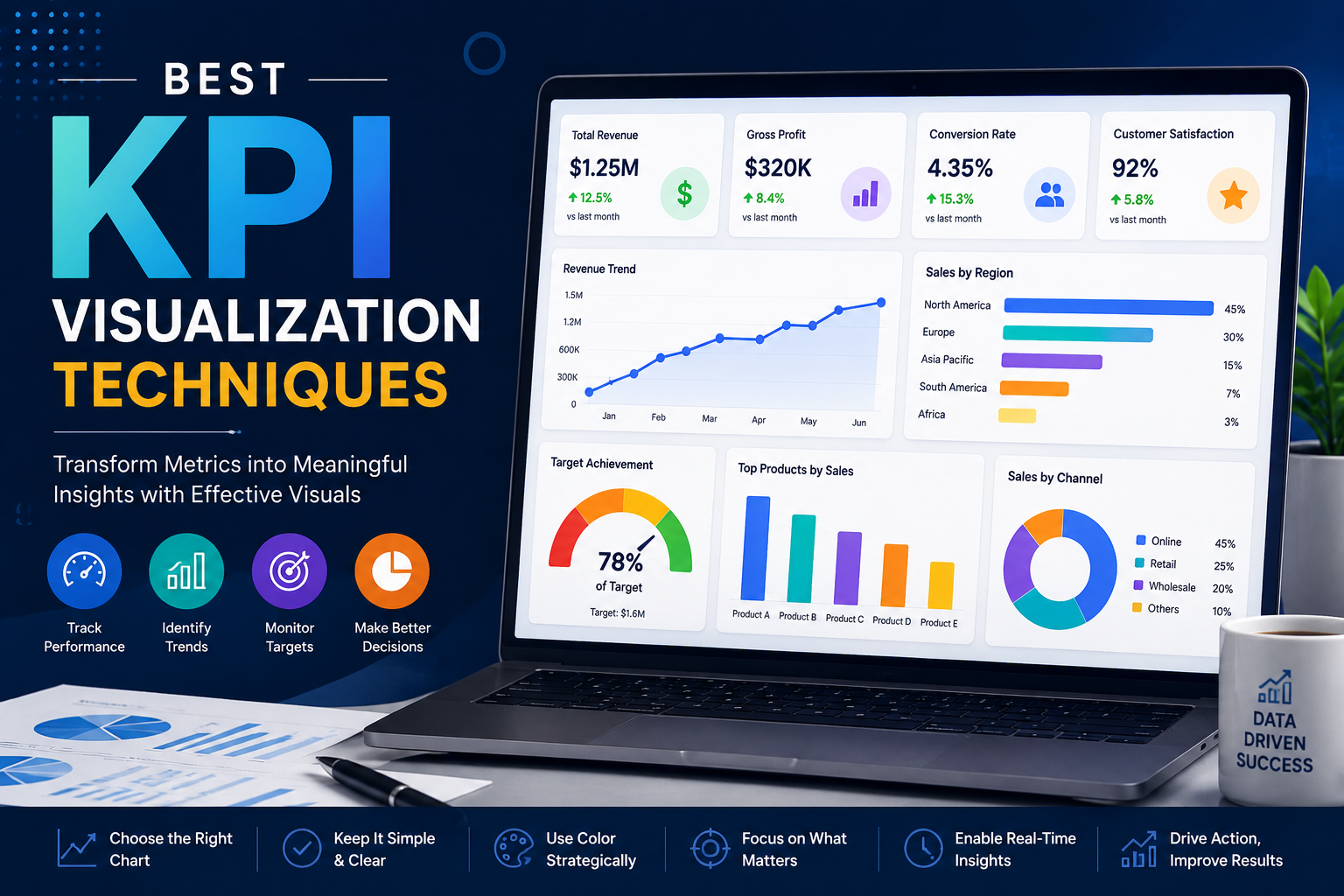
1. Use KPI Cards for High-Level Metrics
KPI cards are one of the most effective visualization techniques for displaying primary business metrics. Dedicated summary cards prominently highlight current values, period-over-period growth percentages, baseline targets, and immediate performance status tags.
They function exceptionally well for tracking high-priority numbers like total revenue, gross profit margins, customer acquisition volume, site conversion rates, workforce retention percentages, and rolling operational costs. KPI cards simplify executive reporting by making high-level milestones obvious at a glance. However, developers should avoid overcrowding layout fields with too many card variants simultaneously.
2. Use Line Charts for Trend Analysis
Line charts are the industry standard for mapping and visualizing performance changes over continuous time intervals. Businesses rely on line charts to trace sales growth trends, revenue pacing, website traffic spikes, digital customer engagement, and workforce productivity patterns.
By charting metrics along a chronological axis, decision-makers can instantly identify positive or negative growth patterns, isolate seasonal consumer fluctuations, and spot anomalous performance dips that require immediate intervention.
3. Use Bar Charts for Performance Comparisons
Bar charts provide an ideal visual format for evaluating categorical data side by side. Organizations frequently use column or bar layouts to compare output metrics across separate departments, physical operating regions, product SKU performance, marketing acquisition channels, and distinct warehouse operational units.
Bar charts naturally improve direct comparison accuracy, visual readability, and overall analytical clarity. Horizontal bar formats function especially well when category labels are lengthy or when comparing multiple metrics within a single sheet view.
4. Use Gauges Carefully
Gauge charts are frequently used to visualize transactional progress against a fixed target line, such as quarterly sales targets, seasonal budget utilization bounds, or machinery operational efficiency scores.
While a dial can offer quick visual feedback, gauges should be deployed sparingly. Overloading a workbook with radial gauge shapes can rapidly clutter a dashboard, consume excessive layout space, and obscure deeper analytical trends. Modern dashboards increasingly replace complex gauges with cleaner linear progress indicators.
5. Use Heat Maps for Pattern Detection
Heat maps help organizations instantly spot density patterns, hidden operational bottlenecks, shifting consumer engagement trends, and workforce activity hot spots. Companies frequently deploy heat-mapped grids to monitor employee attendance exceptions, high-volume checkout hours on ecommerce sites, regional sales performance, and system health monitors.
Leveraging strategic color intensity upgrades a user's pattern recognition ability, making heat maps incredibly valuable when trying to read complex datasets containing multiple overlapping variables.
6. Use Bullet Charts for Target Tracking
Bullet charts are highly effective, space-saving alternatives to traditional circular gauge charts. Within a single, compact horizontal bar structure, a bullet chart clearly surfaces actual performance values, primary target lines, and qualitative performance thresholds (such as poor, satisfactory, and excellent bands).
They work perfectly for tracking revenue goals, complex project completion percentages, departmental spend boundaries, and specific financial performance metrics, maximizing data density without causing visual clutter.
7. Prioritize Simplicity in KPI Dashboards
One of the most persistent dashboard mistakes in corporate reporting is excessive design complexity. Overbuilt views frequently suffer from an overabundance of charts, highly saturated color palettes, unnecessary animations, and non-essential background metrics.
These elements decrease user scannability, lower organizational tool adoption, and slow down time-to-insight. High-performing KPI dashboards ruthlessly focus on visual simplicity and precise business relevance, allowing a viewer to pull key insights within seconds of loading.
8. Use Color Strategically
Color palettes play a huge role in the structural legibility of business analytics. Developers should utilize neutral, understated colors for baseline structures, reserving bright accents or functional conditional colors (such as soft greens, ambers, and muted reds) to explicitly signal metric statuses:
- Muted Green to show metrics exceeding target performance bars
- Soft Amber to warn of items approaching risk thresholds
- Muted Red to highlight critical underperformance requiring immediate review
Enforcing a clean, minimalistic color language ensures that color guides interpretation rather than creating an unneeded visual distraction.
9. Implement Real-Time KPI Monitoring
Modern enterprise teams demand live operational data feeds to maintain supply agility. Real-time visual dashboards remove reporting lag by continually refreshing active counts directly from live business databases. This immediate tracking keeps logistics operators, financial controllers, and digital marketers constantly updated on sudden demand shifts, fulfillment leaks, or infrastructure changes as they happen.
10. Use Interactive Dashboard Features
Static charts restrict analysts to a predefined, rigid view of business performance. Implementing interactive analytics features—such as custom dimensional filters, drill-down path explorations, fluid date range pickers, and context-aware cross-filtering—allows business users to explore metrics independently. This flexibility turns standard dashboards into powerful self-service environments for root-cause discovery.
11. Standardize KPI Definitions
Organizations frequently battle internal reporting discrepancies when separate departments establish isolated calculation logics for identical business terms. If finance, field sales, digital marketing, and operations groups use different parameters to define a core metric like "customer churn," reporting metrics will naturally clash.
Solution: Establish KPI Governance
Organizations must establish a centralized data semantic framework to govern logic calculations before mapping metrics to a visualization tool. Enforcing unified enterprise-wide reporting standards removes systemic discrepancies, builds absolute corporate trust in dashboard outputs, and supports clean analytics scalability.
12. Optimize Dashboards for Mobile Devices
Corporate executives, regional managers, and field staff require instant visibility into operational stats while working on the move. Utilizing modern responsive grid layouts across Power BI, Tableau, or Looker Studio ensures that high-priority KPI cards dynamically restack to fit smartphones and tablets, preserving readability across all device types.
Common KPI Dashboard Mistakes
Deploying data dashboards without a cohesive plan can create operational bottlenecks. Common enterprise development issues include:
- Visual Clutter: Overwhelming a single view with dozens of charts and disconnected widgets
- Confusing Chart Selection: Using complex radial models when simple bar charts or line graphs provide clearer insights
- Backend Performance Lag: Allowing nested calculations or unoptimized queries to slow page loads
- Governance Silos: Presenting non-standardized metrics that generate cross-department alignment confusion
Overcoming these issues requires an intentional, user-centered design strategy paired with solid database engineering.
Future of KPI Visualization
As enterprise digital transformation continues accelerating in 2026 and beyond, the next generation of business intelligence centers around cloud-native platforms, predictive monitoring, automated AI insights, and conversational BI environments.
Integrated AI layers will automatically run background query optimizations, generate text summaries explaining performance changes, and flag data anomalies before human operators notice them, transforming dashboards from retroactive review sheets into proactive decision assets.
How KnexBI Helps Businesses Build KPI Dashboards
At KnexBI, we partner with modern corporations to turn unorganized data streams into highly interactive, secure, and fast executive KPI dashboards.
Our technical engineering teams focus on:
- Designing and launching corporate-grade dashboards in Microsoft Power BI, Tableau, and Looker Studio
- Connecting disparate data sources into optimized, single data models
- Tuning and fixing slow dashboard rendering metrics and unoptimized database queries
- Deploying clear, reliable metric governance frameworks to eliminate reporting silos
Our direct, technical approach removes the manual work of building reports, giving your management teams the clear, accessible intelligence they need to make faster, evidence-based business decisions.