
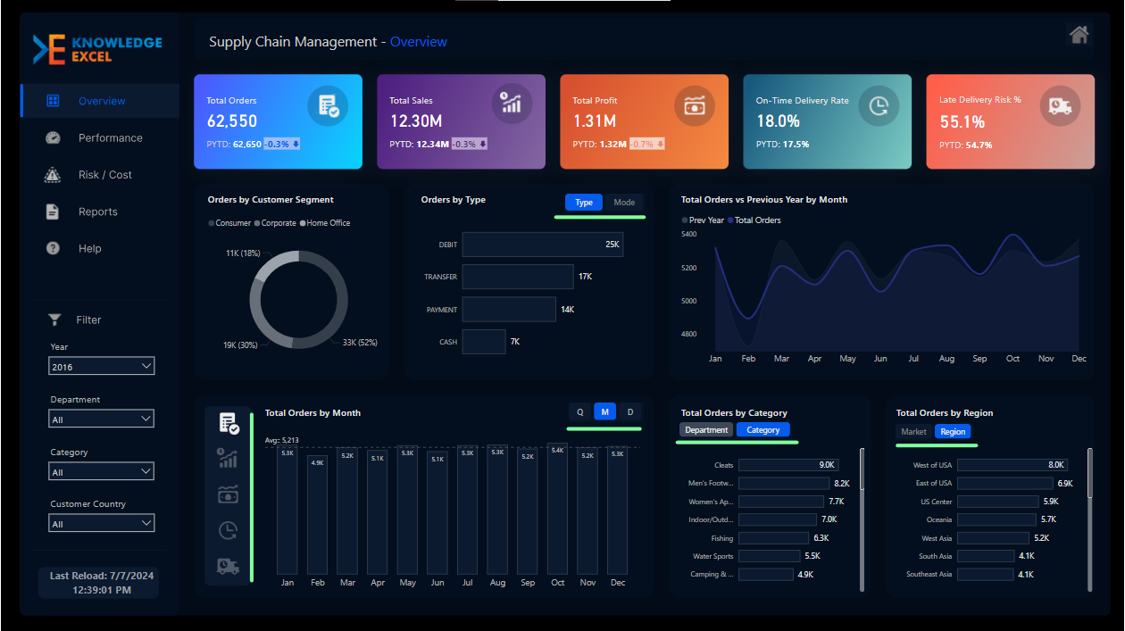
Simplify Decision-Making with Dynamic Metric Switching in Power BI
Learn how to simplify decision-making using dynamic metric switching in Power BI. Create interactive...
Feb 25, 2026
 5 min read
Explore the most effective KPI visualization techniques including KPI cards, line charts, bar charts, heat maps, real-time dashboards, and interactive business intelligence reporting.
55 min read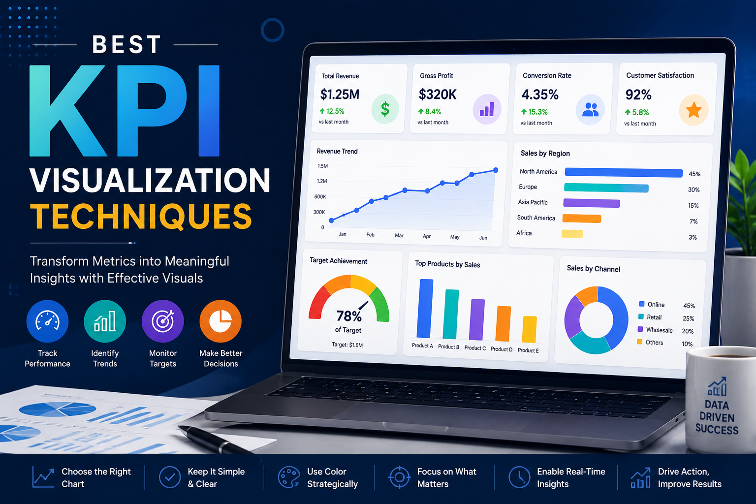
21 articles found
Learn how to simplify decision-making using dynamic metric switching in Power BI. Create interactive...
5 min read
Build interactive Power BI dashboards to track KPIs, automate reporting, and gain real-time insights...
7 min read
Learn the basics of Power BI and how to create your first dashboard.
5 min read