

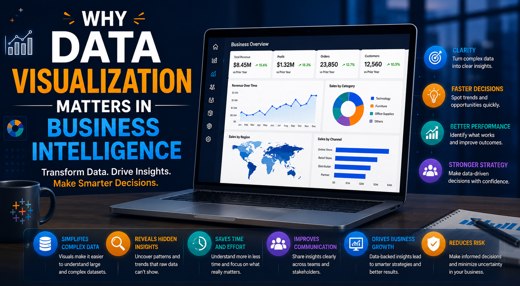
In today’s digital economy, businesses generate enormous amounts of data every second. From customer interactions and sales transactions to marketing campaigns and operational processes, organizations continuously collect information from multiple systems and platforms.
However, raw data alone has very little value unless businesses can interpret it effectively. This is where data visualization becomes one of the most important components of modern business intelligence.
Data visualization transforms complex datasets into interactive charts, dashboards, graphs, and visual reports that help organizations understand patterns, trends, and performance more clearly. Modern business intelligence is no longer only about collecting data. It is about making data understandable, actionable, and accessible for decision-makers across organizations.
At KnexBI, businesses increasingly implement modern data visualization strategies to improve reporting, streamline analytics, and accelerate data-driven decision-making through platforms such as Tableau, Microsoft Power BI, and Looker Studio.
In this article, we’ll explore why data visualization matters in business intelligence, how organizations use it across industries, and why visual analytics continues becoming essential for modern enterprises in 2026 and beyond.
Understanding Data Visualization in Business Intelligence
Data visualization refers to the process of presenting data in graphical and visual formats that simplify analysis and interpretation.
Instead of reviewing spreadsheets, rows of numbers, or disconnected reports, business users can interact with:
- Interactive dashboards and charts
- Heat maps and geographic visualizations
- KPI scorecards and metric dials
- Trend lines and real-time streaming charts
Business intelligence platforms use data visualization to help organizations identify patterns, monitor performance, track KPIs, discover hidden operational opportunities, and support macro strategic decision-making. Visualization makes data significantly easier to consume for both technical and non-technical users. This accessibility is one of the biggest reasons why visual analytics has become central to modern enterprise data strategies.
Why Traditional Reporting is No Longer Enough
For many years, businesses relied heavily on static reports and manual spreadsheets for operational analysis. Although spreadsheets remain useful tools, they present massive procedural limitations as operations scale:
- Cognitive information overload from dense data grids
- Severe manual reporting delays and human compilation errors
- Zero real-time interactivity or exploration functionality
- Inability to identify long-term macro trends easily
- Complex, siloed data interpretation across separate business units
As businesses grow, datasets become structurally larger and more complex. Modern corporations now require real-time visibility, centralized semantic dashboards, automated pipelines, predictive forecasting insights, and highly scalable analytics environments.
Traditional static reporting simply cannot efficiently keep up with these modern business demands. Data visualization effectively solves this bottleneck by turning abstract rows into intuitive visual assets.
1. Data Visualization Simplifies Complex Data
One of the biggest reasons data visualization matters is its core ability to distill highly complex datasets. Enterprise environments frequently require analysts to sift through millions of historical rows, overlapping database sources, financial indicators, and live transactional metrics.
Reading raw numbers manually is inherently inefficient. Visual analytics engines transform this backend clutter into organized dashboards, letting everyday business leaders instantly spot macro business trends, operational anomalies, core correlations, and underlying business behaviors.
2. Faster Decision-Making
Modern companies operate in fast-moving environments where delayed execution can quickly lead to lost market share and missed revenue milestones. Data visualization dramatically compresses time-to-insight by serving up live real-time metrics, instant KPI tracking, and centralized enterprise-wide access.
Instead of waiting days for an analyst to manually compile a deck, executives can keep their fingers on the pulse of corporate performance via live dashboards, enabling proactive course-corrections.
3. Improved Business Intelligence Adoption
A persistent challenge in corporate business intelligence initiatives is low employee adoption. Legacy systems often feel overly technical, requiring heavy database knowledge or advanced query skills to uncover basic operational insights.
Data visualization removes this friction point entirely. Interactive, web-based layout environments invite non-technical team members—from field marketers and sales representatives to finance managers and HR directors—to independently click through, explore, and run personal queries without tech dependencies.
4. Better Identification of Trends and Patterns
The human visual cortex processes graphical information significantly faster than tabular text or numerical spreadsheets. Data visualization maximizes this biological reality, allowing operators to spot revenue shifts, changing user actions, and manufacturing leaks in a fraction of the time.
Line charts make long-term sales velocities immediately obvious, geographic map overlays highlight physical expansion markets at a glance, and heat-mapped grids flags operational fulfillment gaps instantly.
5. Enhanced KPI Monitoring
Keeping tabs on Key Performance Indicators is vital to standardizing operational velocity. Teams use visualization suites to track revenue targets, customer acquisition costs, asset utilization rates, and pipeline velocities. Dynamic alert indicators highlight tracking anomalies immediately, ensuring full company alignment and keeping teams strictly accountable to their performance goals.
6. Real-Time Operational Visibility
Fast-moving consumer environments demand instantly updating operational intelligence. Visual data streams keep modern corporations constantly informed of supply chain movements, live storefront sales, plant asset performance, delivery route conditions, and ongoing digital campaign conversions.
This continuous operational awareness lets businesses respond instantly to flash supply shocks, traffic spikes, or logistics delays.
7. Data Storytelling Improves Communication
Raw numbers rarely shift corporate strategy unless the broader team can understand the structural story behind them. Data visualization acts as a translation layer, contextualizing messy analytics into clear business narratives. By combining descriptive metrics, targeted comparison charts, and user filters into a unified dashboard, developers can seamlessly explain the "why" behind complex business phenomena.
8. Supports Strategic Business Planning
Long-term corporate roadmapping depends on stable historic references and reliable market trends. Visualization platforms give executives clear lookback access to evaluate financial trajectories, shifts in product margins, and changing customer demand. This visual clarity ensures safer budget modeling and more confident strategic execution.
9. Encourages a Data-Driven Culture
Transitioning an organization into an evidence-based culture requires putting information directly into the hands of the workforce. When transparent dashboard setups replace guesswork, decision-making naturally becomes less reliant on anecdotal assumptions and more anchored to verified operational facts. This shifts everyday meetings from speculative discussions to data-backed planning sessions.
10. Improves Customer Analytics
Isolating shifts in user purchasing pathways, long-term churn cycles, and product retention slopes is essential for maintaining strong digital margins. Dedicated customer dashboards help marketers break down audience groups by demographic traits, platform actions, and lifetime values, providing the clarity needed to create personalized cross-sell plays.
11. Enhances Marketing Performance Analysis
Modern growth teams pull multi-channel data from disparate ad engines, SEO monitors, site activity taggers, and email applications. Centralizing these streams into cohesive charts lets marketers cleanly match live cost metrics with down-funnel acquisition value, dramatically optimizing ad spend efficiency.
12. Reduces Reporting Complexity
Large corporate ecosystems often suffer from fragmented, redundant reporting loops where separate branches accidentally build duplicate versions of the exact same spreadsheet. Centralized data models and unified dashboard assets streamline this sprawl, lowering organizational overhead and ensuring a consistent source of truth across all offices.
13. Supports Predictive Analytics
Modern business intelligence increasingly incorporates machine-learning engines and automated forecasting paths. Advanced BI setups visualize statistical regression curves, confidence bands, and AI anomaly alerts directly within standard layouts, helping managers shift away from purely retroactive reporting and adopt predictive risk-management strategies.
14. Data Visualization Helps Across Industries
The practical utility of graphic data visualization cuts across nearly every major modern business sector:
- Healthcare: Patient care visibility, asset monitoring, and bed management tracking
- Finance: Live profit tracking, compliance auditing, and expense tracking
- Retail & Ecommerce: Cart conversion optimization, market demand maps, and inventory health
- Supply Chain & Logistics: Inbound freight tracking, fleet speeds, and warehouse capacity tuning
- Human Resources: Workforce churn patterns, recruitment pipeline steps, and training logs
Common Data Visualization Tools Used in Business Intelligence
Several key visual platforms dominate the enterprise analytics ecosystem, with selections usually guided by corporate infrastructure, scaling demands, and database types:
- Tableau: Celebrated for its advanced analytical depth, granular custom controls, and exceptional visual rendering capabilities across huge datasets.
- Microsoft Power BI: Extensively deployed due to its deep native integration with the Azure cloud environment and MS Office architecture.
- Looker Studio: Popular for quick web dashboard generation, particularly when native connections to Google Cloud datasets are favored.
Common Challenges in Data Visualization
Despite the immense power of visuals, building dashboards without a solid strategy can create corporate bottlenecks. Common design missteps include overloaded dashboard layouts that obscure key insights, poor chart selections that misrepresent performance, messy underlying data structures that drag down load speeds, and fragmented naming metrics across departments.
To unlock the true potential of visual analytics, organizations must anchor their deployment to clear, standardized data modeling pipelines and intentional visual design governance rules.
Best Practices for Effective Data Visualization
To ensure your dashboards drive meaningful business action and remain easy to navigate, make sure your development teams follow these design rules:
- Focus heavily on simplicity: Ruthlessly cut out decorative widgets or unnecessary text elements that clutter the layout.
- Match data with the right chart type: Use line graphs for temporal trends, bar layouts for categorical values, and maps for geographic metrics.
- Highlight primary indicators: Place high-level KPI cards at the top left of the screen for immediate executive viewing.
- Maintain optimization hygiene: Streamline calculation configurations on the backend to keep page load delays to an absolute minimum.
How KnexBI Helps Businesses Build Data Visualization Solutions
At KnexBI, we partner with modern enterprises to transform unorganized data pipelines into highly interactive, blazing-fast visual assets.
Our specialized development services focus on:
- Designing clean, enterprise-wide dashboards in Tableau, Power BI, and Looker Studio
- Optimizing and tuning sluggish dashboard rendering speeds and sluggish backend SQL queries
- Unifying fragmented warehouse pipelines into a clean, single data model layer
- Deploying clear analytics governance programs to prevent dashboard sprawl
We strip away the manual work of building reports, giving your management teams the clean, accessible intelligence they need to make faster, revenue-generating decisions.
The Essential Nature of Modern Visual Analytics
Data visualization isn't just about making corporate reports look good—it's a core component of modern business intelligence. By turning dense, hard-to-read database records into interactive graphical assets, it enables teams across any company to spot market trends faster, address operational leaks immediately, and make decisions based on clear evidence.
As enterprise data volumes grow in 2026 and beyond, companies that build clean, responsive visual data systems will maintain a significant advantage in operational speed, team alignment, and strategic execution.